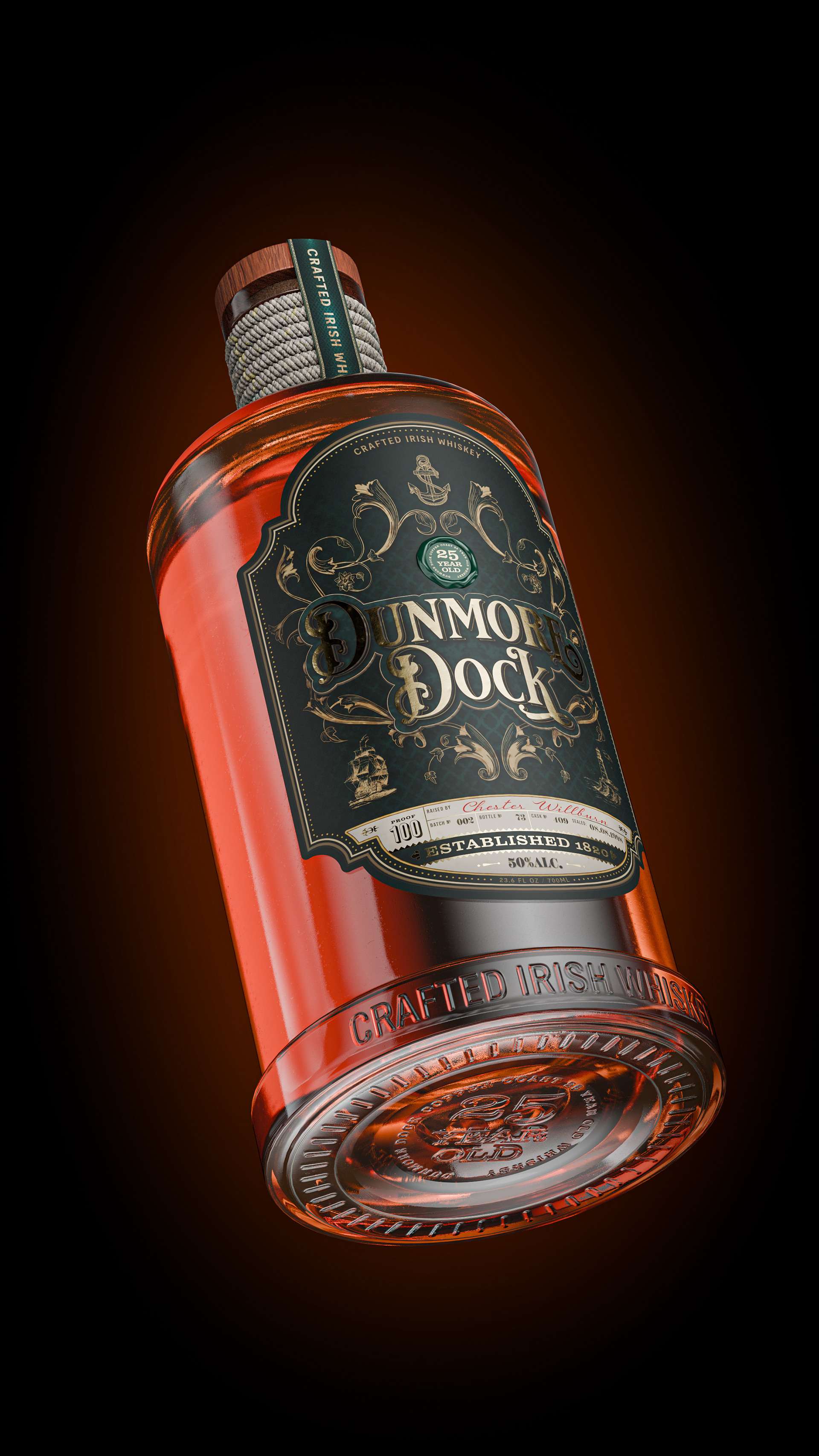
The concept behind the Dunmore Dock whiskey label is deeply rooted in the history and maritime culture of the Irish coast. The name Dunmore Dock evokes imagery of a rugged harbour, a gateway for sea voyages, and a symbol of endurance and craft. Dunmore Dock embodys the spirit of the sea, timeless and full of character.
The goal of Dunmore Dock was to create a brand that would resonate with both whiskey connoisseurs and those drawn to a romanticised sense of place. To achieve this, the label needed to convey a strong maritime heritage, drawing from Ireland’s rich seafaring history. The label needed to represent the connection to the coastal town and its stories of sailors, merchants, and dockworkers.
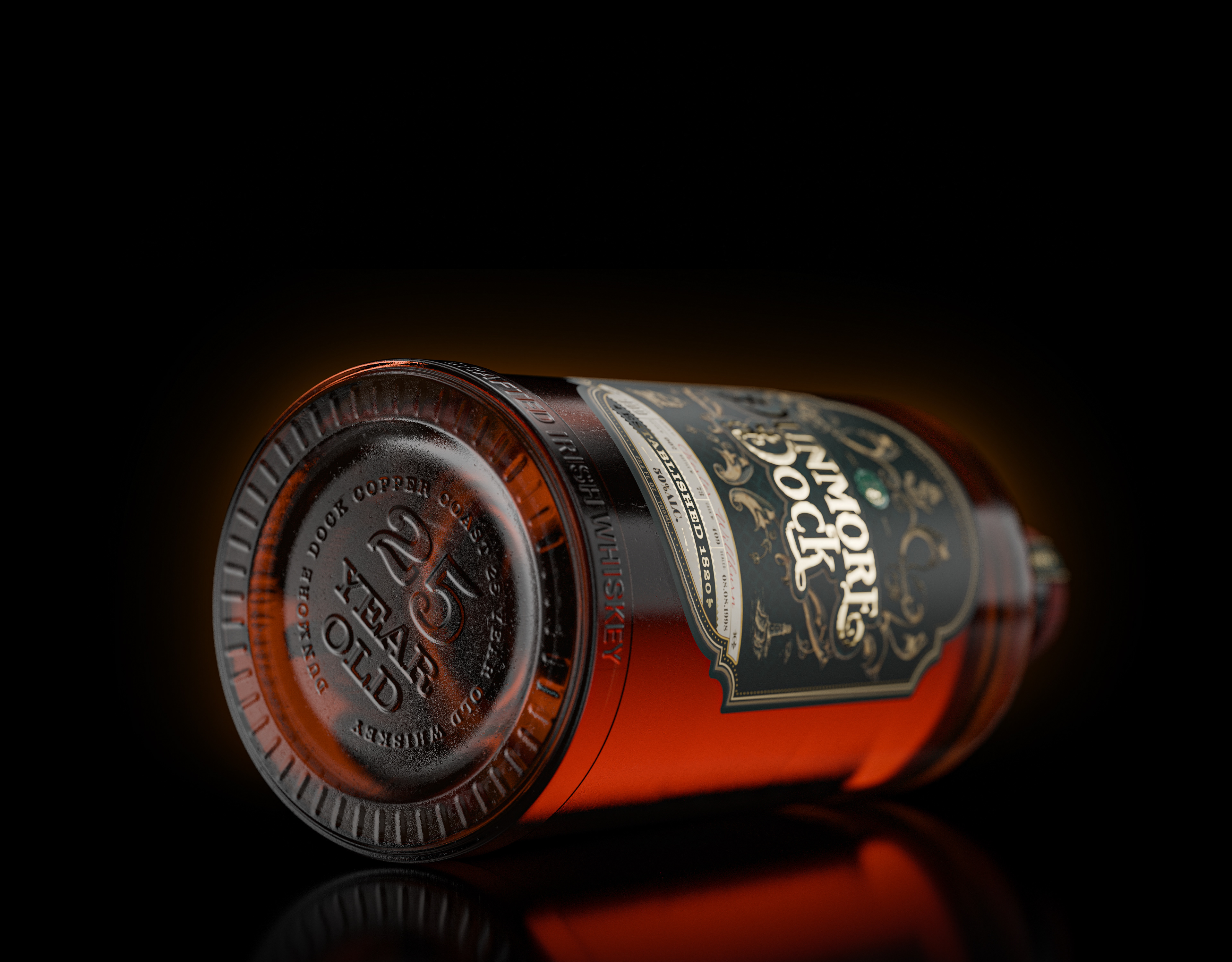
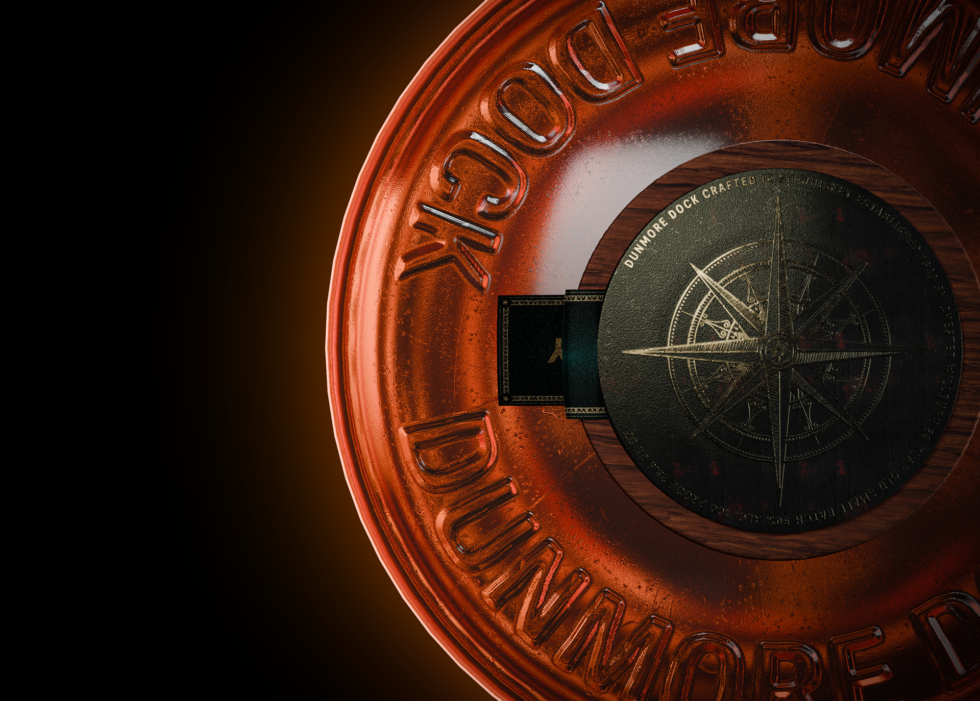
With key works of Elegance and Craftsmanship in mind, the branding needed to reflect a level of care and tradition while communicating both strength and refined nature of spirit. The bottle itself also required a simplistic and timeless design, honouring the past while appealing to modern tastes. This balance was essential for capturing the spirit of a legacy brand.
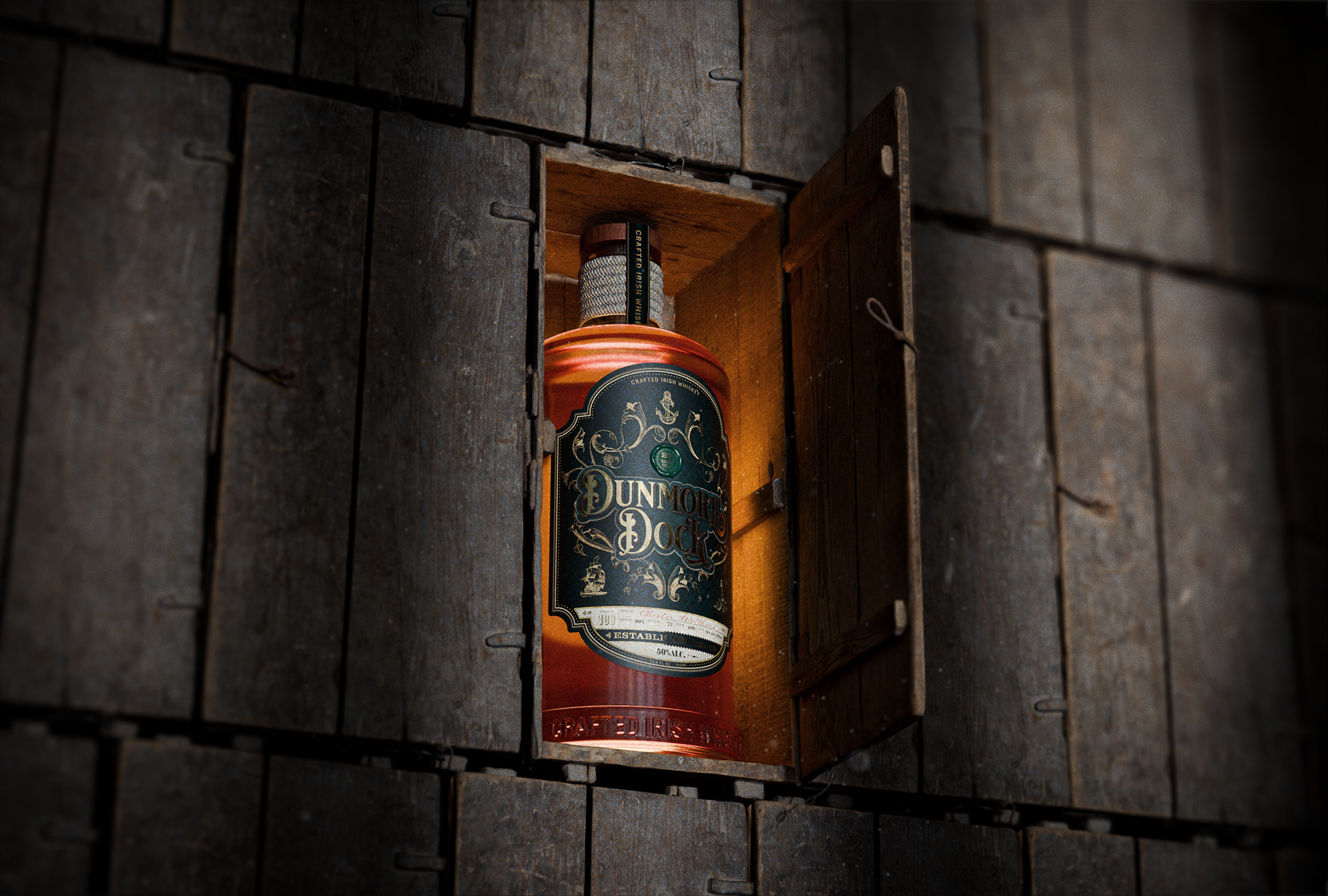
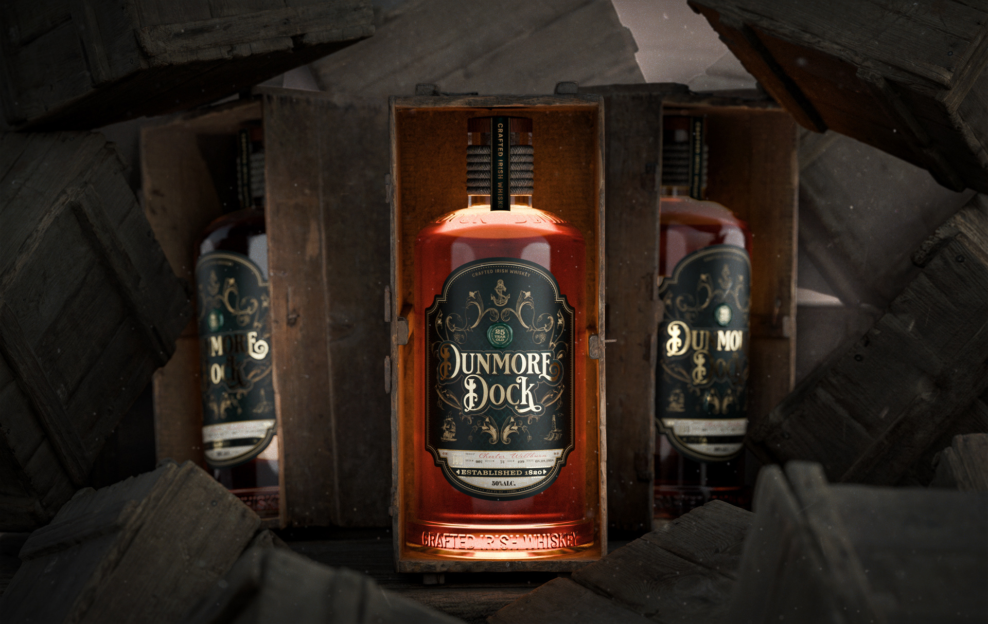
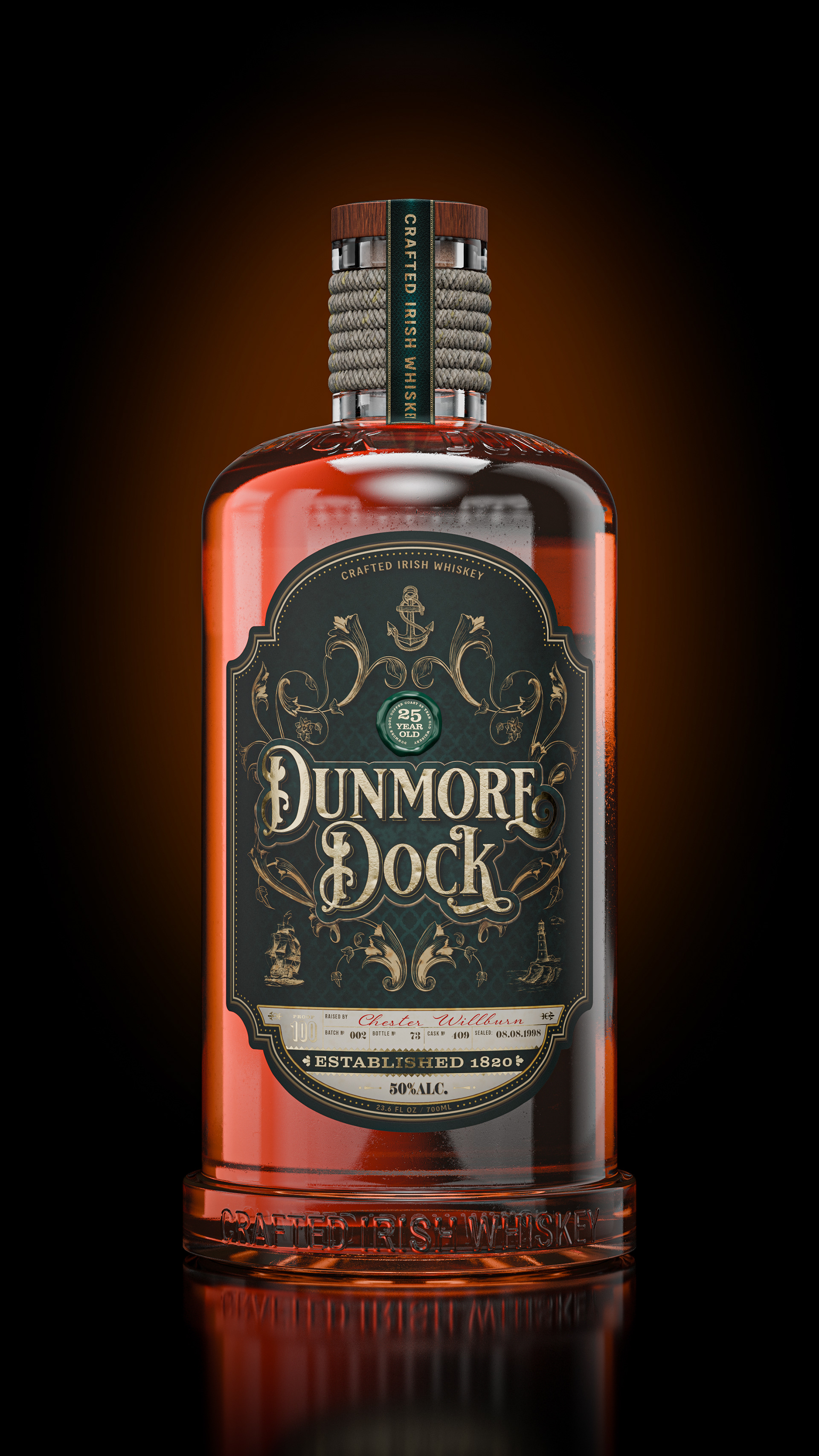
The label prominently features a hand-drawn illustration of a traditional dock scene, with a detailed depiction of old piers, wooden barrels, and ships. This illustration is central to the branding, helping the consumer make an immediate connection to the maritime heritage. The ship in the background symbolises exploration and adventure, while the dock imagery grounds the brand in tradition and craftsmanship.
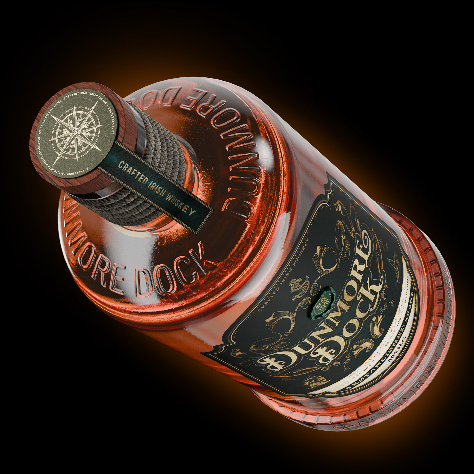
To elevate the tactile experience, the label is printed on textured paper, evoking the rough feel of old parchment or maps. This texture helps convey the authenticity and craftsmanship of the product. Foil embossing is used for the brand name, enhancing the luxury aspect while maintaining the maritime, rugged aesthetic.
To elevate the tactile experience, the label is printed on textured paper, evoking the rough feel of old parchment or maps. This texture helps convey the authenticity and craftsmanship of the product. Foil embossing is used for the brand name, enhancing the luxury aspect while maintaining the maritime, rugged aesthetic.
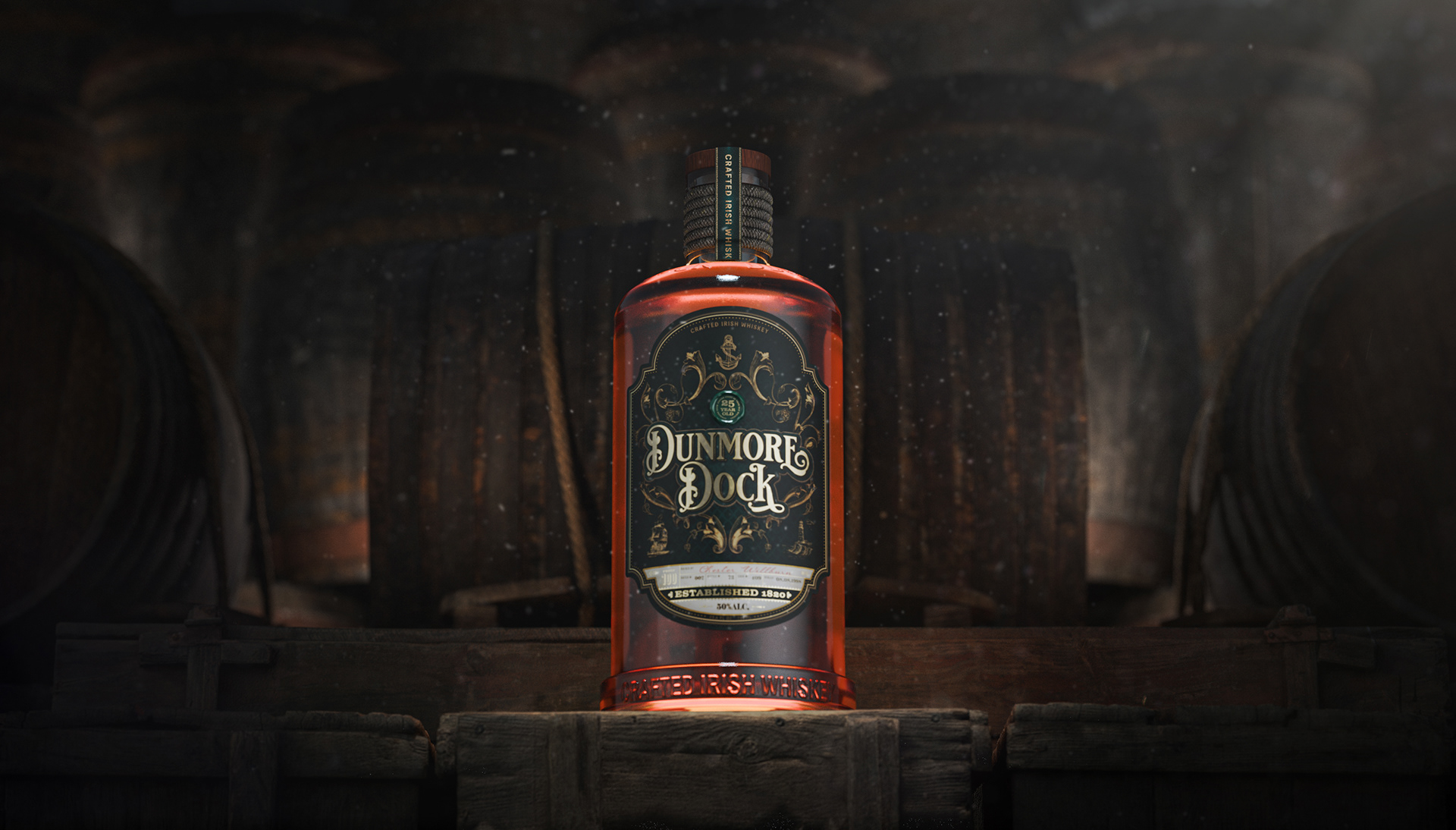
The final design includes subtle details like rope motifs framing the label, reminiscent of ship rigging. The year of establishment is discreetly placed beneath the brand name, adding to the sense of legacy.
In summary, the Dunmore Dock whiskey label design combines historical references, elegant typography, and maritime-inspired imagery to create a premium product that tells a story. It merges tradition with modern refinement, ensuring it appeals to whiskey lovers who value both heritage and craftsmanship.